iOS 14 was released on September 16, 2020, and has been adopted at a faster rate than iOS 13 was. Within a week of becoming available, iOS 14 had already been installed on 20% of all active iOS devices.
iOS users are the fastest upgraders, and after a dozen years of apps and the App Store, iOS developers have learned to prepare for new operating systems well in advance.
This level of preparation can save you time, money and customer frustration.
The changes in iOS 14 are focused around privacy and usability. They’re not likely to cause any app that worked in iOS 13 to crash or refuse to launch.
This article will list the most important factors that you or your developers should consider when building an app that targets iOS 14.
1. iOS 14 Device Support
The first question many people ask when a new version of iOS is introduced is “Will it run on my device?”. With each new version of the operating system, it’s quite common for a device or two to “age out” and no longer be supported.
Fortunately, that’s not a problem with this version. If a device can run iOS 13, it can also run iOS 14. This means that iPhones from the 6S and later are supported, as is the iPad Air 2 and later models.
2. Privacy Enhancements in iOS 14
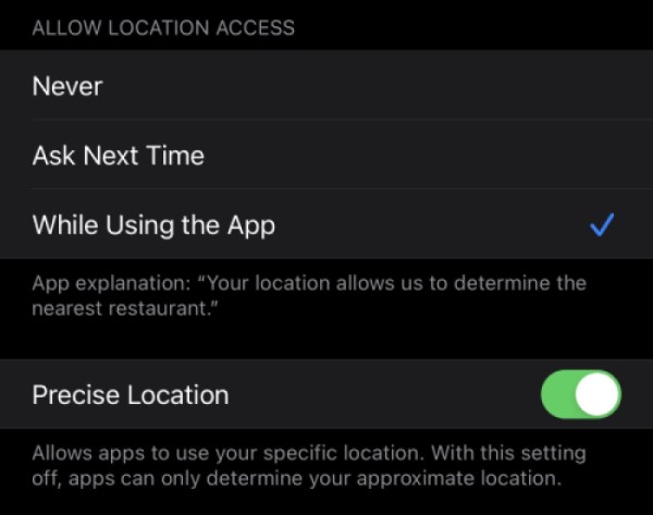
iOS 14 includes a privacy enhancement that could affect your apps and the way they are used: The “Precise Location” option, which appears in the Settings for any app that uses location services.
When Precise Location is set to its default setting of “on”, geolocation works as it did in earlier versions of iOS.
When it’s set to “off”, the accuracy of the reported user’s location will be somewhere between 1 and 20 kilometers (between 0.6 and 12 miles) of the user’s actual location. Apps can programmatically check this setting.
Closer to the end of 2020, the App Store will display the types of data that each app collects, and whether the information is used to track the user or is connected to their device or identity. This will require developers to provide additional information about their apps in App Store Connect.
3. iOS Widgets
Widgets are extensions of apps that present key information on the Home screen. They provide “at a glance” information from the app, without requiring the user to open it. Tapping the widget opens its app.
For example, the Weather app that comes with iOS has a widget that lets you see the temperature and forecast for your current location. A scheduling app’s widget can display the user’s next scheduled activity.
If your users need information from your app quickly and often, you should consider creating a widget for it.
4. iOS App clips
Of the new features in iOS 14, app clips are the biggest potential game-changer for app developers. They’re “lite” or “trial” versions of an app that offer a small portion of the full app’s functionality. They download and install almost as quickly as as a web page, and can do almost everything a full-sized native app can do.
Users don’t find app clips in the App Store, and they don’t launch them from the Home screen. Instead, they discover, download, and use them right at the moment they’re needed with the help of app clip URLs.
These are special URLs can be embedded in many places:
- In QR codes, NFC tags and Apple’s new app clip codes, which are a special combination of barcode and NFC tag. These will be used in retail spaces and other real-world situations where an app can be useful.
- In a web page that contains a smart app banner, which is a special HTML element that tells Safari that there’s an app clip that the user might want to use right now
- In a map place card, which tells Apple Maps that there’s an app clip associated with a specific location on a map
- In an iMessage
- In an answer that Siri provides
When the user’s device gets an app clip URL through one of the means listed above, it checks to see if the device has the corresponding app or app clip already installed. If the user has the app or app clip, the device launches it.
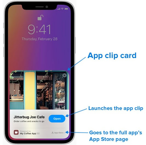
If the user’s device doesn’t have the app or app clip, it displays the appropriate app clip card. Here’s an example showing how it would appear:
An app clip card is a pop-up that explains what the full app and the app clip does. It gives the user the option to either launch the app clip to get immediate results, or go to the App Store to install the full app.
Here’s an app clip use case: The user goes to a coffee shop to buy a coffee. At the counter, they see a sign with a QR code that says “Speed up your order with our app clip!”
The user scans the code with their iPhone, which checks to see if they have the coffee shop’s app or app clip. Let’s suppose that in this case, the user has neither.
The app clip card for the coffee shop appears on the user’s screen. The user taps the “Open” button on the card, which launches the app clip. It downloads and launches quickly, because it’s small and provides only a single function from the full app: Purchasing a coffee. If the user has Apple Pay set up, the app clip can even take care of payment.
Unlike full apps, app clips aren’t accessible on their device home page. Users launch them either when they “discover” them through one of the methods listed above, or by going to the App Library page and choosing from its automatically-generated collection of recently-used app clips.
App clips provide the option of upgrading to the full app. They give the user a convenient “try before you buy” experience, which may help expand your app’s user base.
App clips aren’t meant to be independent applications; they can’t be submitted to the App Store on their own. They must be submitted along with their “parent” app during the review process. There can be only one app clip for each app.
5. iOS 14’s Updated Date Picker
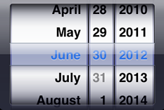
While most of the UI controls were left unchanged in iOS 14, the date picker got a much-needed upgrade. In the beginning and all the way up to iOS 7, it had a look reminiscent of mechanical dials:
With iOS 7, “realistic” controls fell out of favor and were replaced with more abstract ones. The date picker operated in the same way, but its look was significantly pared down:
The “dial” design of the date picker has always taken a lot of screen space, and its iOS 14 redesign addresses that issue.
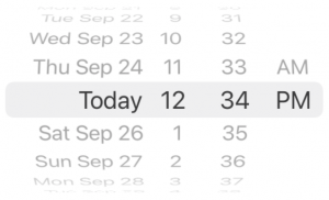
The new date picker has three styles. There’s the familiar “wheels” style, which is provided for compatibility with apps written for iOS 13 and earlier systems:
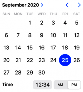
The preferred new style is “inline”, which presents the date and time in the “calendar and clock” format that we’ve all become used to, thanks to web applications:
If you need to use the date picker as an input for a time or interval value, it’s quite compact:
If your UI doesn’t have the space necessary to display a full calendar, use the “compact” style. In its default state, it takes up the same space as a text field:
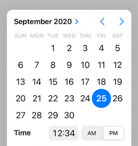
…and when tapped, it expands into a modal overlay that displays the picker in “inline” mode:
6. SwiftUI
The introduction of SwiftUI in iOS 13 gave developers a new framework for building user interfaces. Its declarative approach to UI-building makes it simpler to write a UI that adjusts to different screen sizes and renders appropriately on any Apple device, from the smallest Apple Watch to the highest-resolution desktop Mac screen.
The first version of SwiftUI had a number of “rough edges” and other features that felt incomplete. Apple’s improvements to the framework in iOS 14 would take up their own article, but we can say that their changes to the existing UI views and the addition of new views and supporting objects and interfaces appear to have smoothed out some of those rough edges.
SwiftUI is still a new framework, but Apple is making it quite clear that it’s the way that UIs will be built for all its platforms in the future. It’s not yet time to port your existing apps to SwiftUI, but it is time to start looking into it and building small experimental apps.
Conclusion
iOS 14 brings a lot of good news for app developers, the best of which is that it probably won’t break your existing apps, and it supports the same set of devices that iOS 13 does.
You might want to try improving your app’s usability with widgets to give it a “glance and go” interface, or boost its discoverability with app clips. And you’ll definitely want to prepare for the future by experimenting with SwiftUI. This new OS presents an opportunity to experiment.
