
User Interface (UI) Design isn’t just about beautiful visuals, it’s also about making your product a success.
UI Design encompasses how users will interact with the product via visual touch points in order to navigate from point A to B. If you’re a business owner and you want your software to compete in today’s market, there are a lot of things to consider.
The app should be intuitive, useful and engaging. Apps that are uninteresting, hard to use or outright ugly will get left behind.
This is why it’s so important to have a UI Designer involved when creating a new digital product.
User Experience (UX) designers, while equally important, improve the quality of a user’s interactions with a product or service. They are more concerned with the product’s usability and function, while UI designers focus on the elements that a user will interact with.
The Four Common UI Elements
Humans are aware on a subconscious level of how certain UI Elements should present themselves and behave. So what are these elements?
- Input Controls – Allow users to input information and make selections on an app.
- Buttons, Input Fields, Toggles, Drop Downs, Checkboxes, Radio Buttons, etc.
- Navigational Components – Allow users to move around the app.
- Elements like Tab Bars, Hamburger Menus, Sliders, Tags, Search Fields, Bread Crumbs, Pagination
- Informational Components – These help to keep users informed while using the application.
- Tool Tips, Notifications, Progress Bars, Modal Windows, Message Boxes, etc.
- Containers – Used to group content together in a way that can expand and collapse information
- Accordions
When we think of a to-do list, for example, we usually imagine checkboxes and checking off the tasks we have completed.
When selecting that you want to buy something “new” instead of “refurbished”, we commonly use radio buttons which allow us to make a single selection, rather than multiple selections.
When you are making a purchase on an app and walking through the order stages (such as shipping and billing information, payment, confirmation), it’s nice to have an indicator for how much you’ve completed and what you have left to do. Progress bars are used for situations like this.
These are some examples of commonly used UI elements that we have all grown accustomed to and UI Designers should be familiar with. A way to keep these elements consistent throughout the product is to create a style guide.
Start With a Style Guide
A UI style guide is a set design standards for the graphical UI elements involved in the product to keep it unified and true to the brand. It’s what makes an app visually harmonious and consistent.
Style guides should include a set of guidelines for all the visual aspects of the software such as:
- Component Library
- The UI elements a user will interact with like the buttons and toggles.
- The social sharing, navigation, input/output and content structuring of the product.
- The icon set that the product will be using. Also referred to as “Iconography”
- Logo and Branding
- The rules and specs for the logo, as well as the brand’s guiding principles.
- Color Palette
- Helps to create a proper visual language, keeping in mind the brand colors if they are already established. A color scheme will consist of primary, secondary, neutral and accent colors.
- Typography
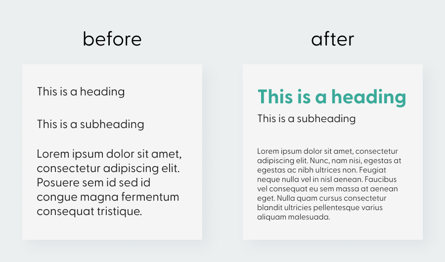
- The style and appearance of text. Often times designers will map out how they want the headings, subheadings, body text and so on to look, using various font weights and sizes.
Why Visual Hierarchy is Important
Visual hierarchy refers to the arranging of elements to show their order of importance using principles such as color, contrast, scale/size, balance and spacing.
It has been said that the average human attention span is only around 8 seconds! So in order for your design to be successful it has to grab the user’s attention and remain interesting.
This doesn’t mean that you have to utilize all of those principles in order to achieve great visual hierarchy. You can actually get by with using just one as long as you use it effectively, although using a combination is recommended.
Using visual hierarchy allows users to know what to focus on, what the call to action is, or the next step in a process.
Another way to grab a users attention and keep them engaged with your product is to connect with them.
Connect With Users Through Evoking Emotion
Emotions are at the heart of how humans navigate their world. We tend to gravitate towards things that make us happy rather than negative experiences. Although this doesn’t mean that all negative experiences are bad, some are useful in helping prevent mistakes from happening again.
A great example of evoking emotions is apps that use gamification, such as Fitbit. Users are rewarded badges for completing daily challenges like a 5,000 step goal. These rewards motivate and incentivize people to keep coming back to the app, because positive behavior is encouraged and rewarded.
Another example of making an app engaging is the use of brand mascots. Mascots can make digital products more personal and memorable. Such as the Geico Gecko and Pillsbury Doughboy.
Another way to inject personality into your digital product is with humor or using simple and easy to understand terminology. Just always keep your target audience in mind, if it’s meant to be a serious app you wouldn’t want to annoy users or come off as cheesy.
A great designer always refers back to what is known as “Human-centered design” which puts the users first in all stages of the design.
This all ties back into creating a design language or style guide. The voice of your brand, its principles and tone. Using certain colors to evoke the emotions you are hoping to convey. Such as using blue colors for its familiarity and trustworthiness. Red for its warmth and passion.
A user interface is like a joke. If you have to explain it, it’s not that good. - Martin LeBlanc Share on XThe Bottomline
A well-done, successful interface requires little thought from the user. They should be able to perform tasks and navigate throughout the app with ease. The product should be reliable, memorable and pleasant to use.


