Accessible design is a design process where the needs of individuals with disabilities are considered, and specific design elements are utilized to create ease of use for these users.
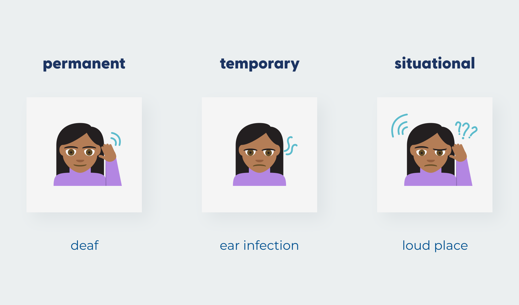
Inclusive design considers the diverse group of people who will use your software, including those with disabilities. It enables people, no matter their circumstance (be it permanent, temporary or situational) to interact with your software efficiently.
Designing for accessibility and inclusion is about putting people first. The users of your product might be sick, under pressure, on-the-go, new to technology or visually impaired.
Some of the more common disabilities to keep in mind when designing for user accessibility:
- Visual Impairments (Blind, color blindness, and low vision)
- Hearing Impairments (Deaf, low hearing, tinnitus)
- Cognitive Impairments (Dementia, confusion, sleep deprived)
- Motor Impairments (Hand tremors, amputations)
- Speech & Language Impairments (Dyslexia, fluency disorders)
Accessible Software Designing for Visual Impairments
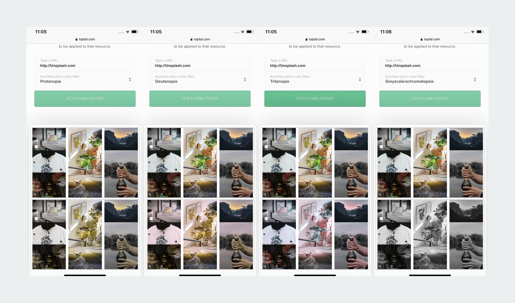
There are ways that you can check an accessible design by viewing your design or website through filters that replicate what someone with color blindness or a visual impairment might see. Toptal has a great resource for this. Simply input your website’s URL and it will show you a visual representation of what someone with protanopia, deuteranopia, tritanopia or even achromatopsia sees.
Another useful tool to check the accessibility for visually impaired users is a contrast checker. Use these to ensure everyone can read your text no matter the color.
According to the Web Content Accessibility Guidelines (WCAG) the visual presentation of text, and images of text, should have a contrast ratio of at least 4.5:1. Except for the following:
Large Text: Large-scale text, and images of large-scale text, should have a contrast ratio of at least 3:1;
Logos, placeholder text & disabled states
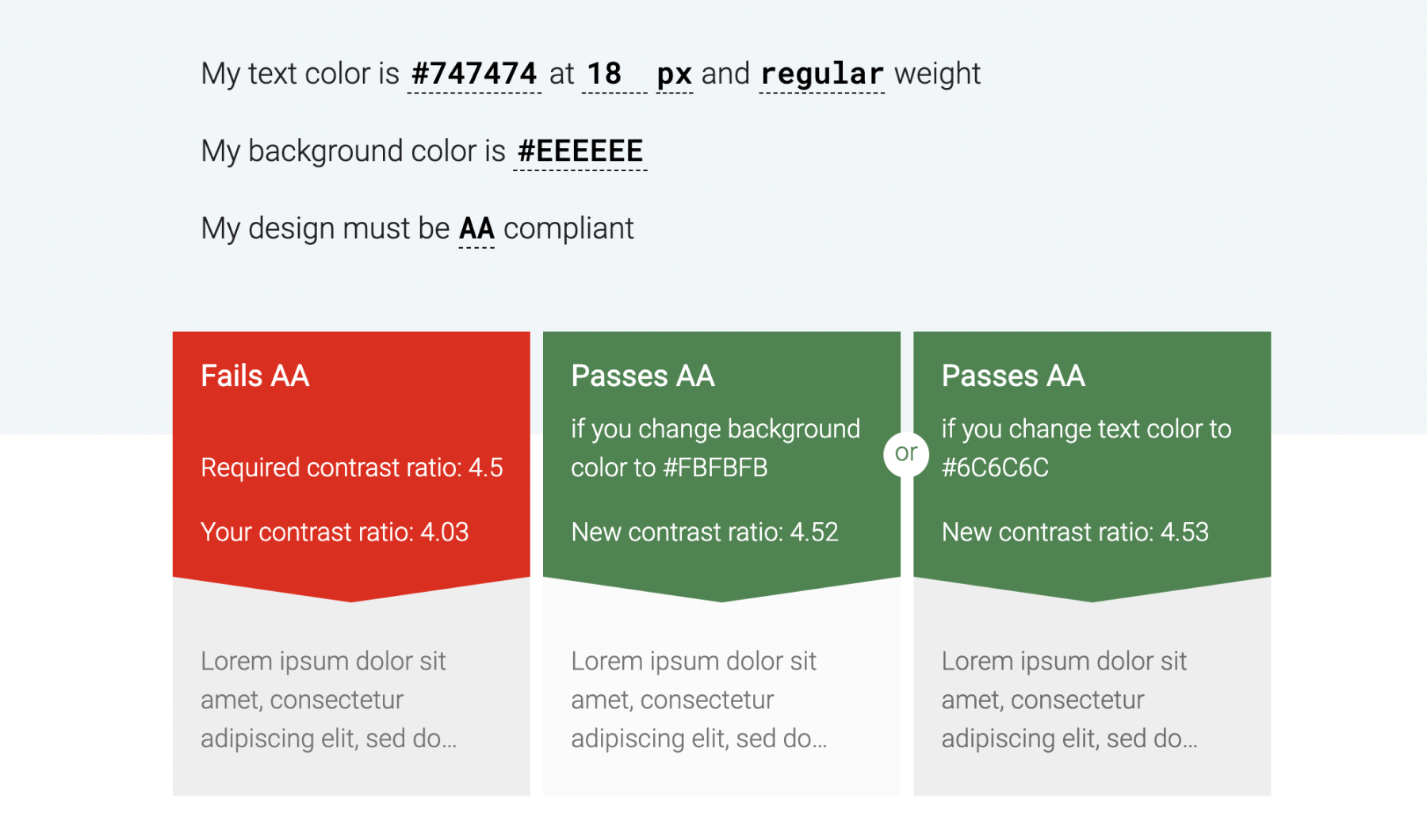
Many design platforms, such as Sketch and Figma, come with plugins you can install that can check the contrast ratio in your designs.
There’s an amazing plugin on Figma from Adee that lets you view the contrast, generate alt-text, and view colorblindness filters.
That’s not all that Figma has to offer. Find out more about what we love about Figma.
Speaking of alt-text, web developers can use what is referred to as “alt-tags” when placing images on a page. These alt-tags are used to describe the image or what the image is representing. This is for the benefit of visually impaired users who use screen readers when browsing the web.
Accessible Software Designing for Hearing Impairments
An example of making sure your app has proper UX accessibility and is accessible for people with hearing disabilities is to make sure that your app doesn’t rely solely on sounds to get your users’ attention.
It’s best to provide a combination of visual and auditory cues for important things like alerts and notifications.
For videos and presentations that contain only audio, it’s best to have transcripts available. A great example of this is Noom’s Weight Loss app. They provide read-aloud lessons that a user can play and listen to. However, if you prefer you can simply scroll past the audio recording player and read the lesson.
For videos you can include captions and subtitles and the ability to mute or unmute it. This is a helpful setting to make available in case your user is in a situation where they do not want sound to play on the video, such as being in a public space.
Accessible Software Designing for Cognitive Impairments
A user interface with an accessible design should be easily understood and prevent situations of cognitive overload.
Don’t make your users stop and think!
Cognitive impairments can affect how a person learns, retains information and makes daily decisions.
Always design with simplicity and consistency. Use common UI patterns that are easily recognizable and understood. Design to prevent user errors from happening in the first place and let users know what they can do to fix the error.
When designing forms or input fields, such as login information, make sure to include labels above or below the input fields. Labels let the user know what the purpose of the field is.
If you only use placeholder text to display what a field is for it can become confusing. For example, once the user clicks on the field to input the text they may forget what the field was for, and need to delete whatever they’ve currently typed to read the placeholder text again.
Accessible Software Designing for Motor Impairments
Motor disabilities come in a variety of forms. They can also be permanent, temporary or situational.
Motor impairments include: muscle weakness, Parkinson’s disease, loss of limb and repetitive stress syndromes. Consider these possibilities when designing your user interface.
Try testing your app across multiple platforms and screen sizes to get an idea of how it would feel to use the app and if the UX accessibility still needs to be improved. Have important UI elements in places that are easy to reach with your thumb, and unimportant elements in harder-to-reach zones.
Make sure these UI elements, like buttons and navigation toolbars, are spaced apart well enough that users have a generous amount of space to tap them. Don’t scrunch fields too close together.
New to UI/UX design? Here’s our UI/UX introduction that makes it easy to understand.
Inclusive Software Design
Designing for inclusivity does not always mean disabilities. It can also include considering users with slow internet, users connected to data rather than Wi-Fi, new and infrequent users, and elderly users.
Below are a few inclusive design examples and strategies we suggest utilizing when creating an inclusive software design.
Inclusive Design to Accommodate Slow Internet or Data Connections
It’s always a good idea to be mindful of the file size of your images. People with slower internet won’t want to sit and wait for your images to load because they’re 2 MB each!
Inclusive Design for New and Infrequent Users
When designing for new and infrequent users of your app, you want the user experience to be pleasant so they will come back. Users should be able to tell where they are in an interface, what they can do and how to accomplish the task that your app sets out to do.
For example, a person who is new to ordering food on an app should have no problems using the app to place their first food delivery order. Using onboarding for new users can help them learn how to use the app, but make sure it can be skipped. This also applies for designing with the elderly in mind.
Inclusive Software Design for Elderly Users
After the age of 65, many adults begin to face unique challenges when using mobile or web applications. Small text may be hard to read, colors with little contrast hard to distinguish and motor skills may start to decline.
Avoid font sizes smaller than 14px. The best agreed upon standard is to start around 16px for most things like text-heavy pages and body copy. If your interface has the option to give people control and let them customize their text size that’s even better. You can use a lot of the methods discussed earlier on how to make your product accessible for older users.
Final Thoughts About Designing Accessible Software
Accessible software includes designing for accessibility and inclusion as well as usability, while also ensuring that your app is visually pleasing. This can be quite the challenge. We recommend having a diverse group of people to test out your product – which can provide incredible feedback.
Looking for further information or insights? Don’t hesitate to reach out to the Big Fish team to learn more about user accessibility in software design and how we can help!