Before I dive into our UX Teardown of the Duke Energy app, a quick explanation of what a UX Teardown is.
A UX Teardown is a review of an app from a user experience perspective, done by a UX Designer. I point out what the app does well, and what could be improved. As a Duke Energy customer, I use this app for real and see opportunities for the utility company to improve the user experience – and the user interface design.
With that said, let’s get started!
Duke Energy is one of the largest electric power holding companies in the United States. Headquartered in Charlotte, NC they serve around 7.8 million customers across six states. The Carolinas, Ohio, Kentucky, Indiana, and Florida.
To better serve their customers they launched an app so customers can:
- Pay their bills
- Report outages
- Learn about offers
- View their energy usage
UX Teardown: What the Duke Energy App Does Well
Let’s start this UX Teardown with the aspects of the user experience that are good.
Home Tab

The first thing you’ll see upon logging into the app is your Account Summary with the payment due date, the amount owed and a button to “Pay Now”. This is very convenient. Especially if you’re a customer who uses your utility company’s app just to pay your bill and move on with your day.
The home screen also features an Outages icon in the top right which leads the user to a screen where they can view a map of outages and report an outage or safety hazard, such as a downed power line.
The Duke Energy app also has a feature that shows customers how their energy usage compares to the same time last year and whether they saved money, or if they ended up paying more.
These are helpful features to have accessible as soon as you open the app.
Offers Tab
The next part of the app I’d compliment is the Offers section. I appreciate the way they use “cards” for each offer and program listed. A card is a container for a few short, related pieces of information.
Instead of the usual card with a photo housed inside and text below it, the entire photo is the card. There is a dark overlay gradient on top of the photo so that the white text on top is contrasted enough to read. The photos are high quality, and one includes an actual Duke Energy employee.

The offers themselves are helpful and there’s an option to schedule a home energy house call. They also provide a “Lower My Bill Toolkit”, more on that later.
UX Teardown: What the Duke Energy App Could Improve
I’m focusing my recommendations on the Energy Usage section of the app as I see a lot of opportunity here.
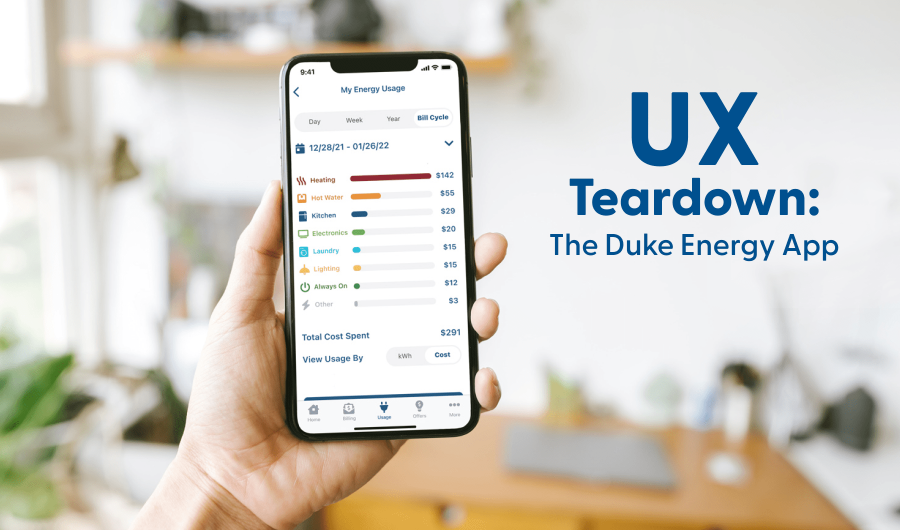
When a customer lands on the Usage tab of the app, there is a lot of data to take in. Some of that data is not intuitive – in particular, the fact that your energy usage is shown in kilowatt hours (kWh).
I question whether the average person knows what a kilowatt hour is and what it ultimately means about their energy usage and their bill.

As you can see above, the energy usage tab lets customers view their energy usage in kWh by day, by week or by bill cycle.
As a Duke Energy customer, I want to see how much money I’ve spent on energy so far this billing cycle, and a historical view of my energy usage throughout the year.
Let’s dive into our suggestions for the Duke Energy app.
6 Ways Duke Energy Could Improve the Energy Usage Tab
We designed new mockups of the energy usage tab to demonstrate our suggested improvements. Our mockups also include changes to the aesthetic – such as a new tab bar and a more modern look.
1. Show the customer’s energy costs in dollar amounts

The first solution we designed is to show actual dollar amounts of energy spent, rather than only the kilowatt hours used. Further, we recommend breaking their spend down by category so customers can see what they spent on:
- Heating or Cooling
- Hot Water
- Kitchen
- Electronics
- Laundry
- Lighting
- Always On
- Other
This could also set the stage for enabling features to be implemented later on, such as settings for high energy usage alerts and budget alerts.
Showing the cost in terms of dollars frames the numbers in a way that everyone understands and is also useful. Then, with the extra breakdown by category of spending, Duke Energy customers will know exactly where they could improve if they want to lower their bills.
2. Provide an option to toggle between cost view and kilowatt hour view
Though we recommend showing energy usage in terms of dollars, the kilowatt hour view can remain and be accessed via a simple toggle that we propose adding to the page.

Customers who are used to seeing, or who prefer to see, the kWh display can toggle between cost view and kWh view. The average American household uses an average of 30 kWh a day, so customers who are well-versed in their average energy use will know at a glance how they’re doing.
3. Show customers their projected energy cost
We next propose that Duke Energy show a projected energy cost graph for a customer’s current bill cycle.

Helpful features like this give utility company customers a reason to come back to the app again and again to see how they’re doing and how much their bill could be by the end of the cycle.
As a Duke Energy customer, I normally only get this information via email. Where my utility company already has this data, I highly recommend that they add this feature to their app.
4. Provide an option to view energy usage over a year
Currently, the utility company’s app has a selector for viewing energy use by:
- Day
- Week
- Bill Cycle
We propose adding a year selector to this so that well-established customers can view their energy usage for an entire year – at a glance.

Right now the only way customers can see this information is by logging into the Duke Energy portal on their web browser.
5. Improve the visibility of energy saving tips and helpful reports
Earlier on I mentioned the “Lower My Bill Toolkit”, which is found under the Offers tab of the app.
It’s the very last offer on the page and tapping on it opens a web browser. It takes a lot of looking around and taps to learn about some pretty important stuff!
Where Duke Energy is investing in creating this helpful information it behooves them to ensure as many customers as possible know about it. As a customer and user of their app, I’d overlooked the Offers tab for a long time, assuming it was just protection plans to enroll in. So I was surprised to see such a wealth of information hidden within this tab.
I recommend moving the Lower My Bill Toolkit, or a few items from it, to the usage tab where it will be more visible to customers interested in their energy usage.

It would also be nice to see how your energy use compares to other homes in your area of similar size and build. We’ve added a card for that.
Normally Duke Energy customers get these home comparisons by mail, but as a customer, I would find it more helpful if I could just view it on the app rather than open a piece of mail to get that same information.
6. Add an option to sign up for energy usage alerts
The last suggestion we’ll cover here is to include a place in the app where customers can set budget and usage alerts.
As a Duke Energy customer the only way I can sign up for these alerts now is by logging into their web portal on a browser. I then provide my email address, take a survey and set my notification preferences to receive the alerts by text or email.
We’d like to see Duke Energy include a place in the app where customers can enable and manage the alerts. As it stands, there’s a lot of hunting in the browser to get to these features.

The energy usage tab is one place where customers could be made aware of this feature while they are already looking at their current energy usage.
Saving energy saves the customer money in the long run. Encouraging customers to learn about their energy usage, view projected costs, and manage alerts will allow them to make better-informed decisions.
Interested in a UX Teardown of Your Company’s App?
If your company already has an app and you’re concerned about the user experience or overall look and feel of it, you may want to consider hiring our app design team to perform a review and make recommendations.
As an App Design Company we have a proven process to redesign your app if needed. Your app needs a design update if:
- Your corporate branding has changed since the last time the app was updated
- Your app hasn’t been updated in over a year
- Users of the app are complaining about it being hard to use, outdated or not working well
If you’re interested in hiring our team, or receiving a UX Teardown – let’s talk!