Before diving into creating mockups, it’s important to set the visual direction of an app or software design project.
This is where mood boards come in. Mood boards are a tool that our app design company uses to establish the style of the app and ensure that all stakeholders are on the same page before we start the UI design process.
What is a Mood Board?
A mood board is a collection of visuals curated by a designer to set the feel and creative direction for a design project. They’re popular in a variety of industries, including interior decorating and corporate branding.
In our case, we put mood boards to use when designing software. They’re an effective way to get all stakeholders on the same page about a visual direction for the product, and what ‘vibe’ they want to create.
The visuals we curate can include images, icons, words and patterns – but more on that later.
UX/UI Mood Board Examples
Here is an example of two UX/UI design mood boards we created for a company in the financial investments industry whose guiding words are:
- hip
- secure
- innovative
- friendly
- convenient
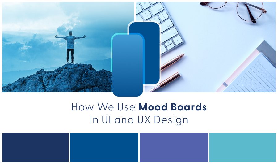
I. Mood Board Example – Nature Theme
The first mood board is grounded in nature. The idea of planting a seed that grows into a tree is like investing. It also has an eco-friendly vibe which is hip right now. The color blue evokes trust and the feeling of being secure. Showing images of the app in use on-the-go brings out the convenience aspect.
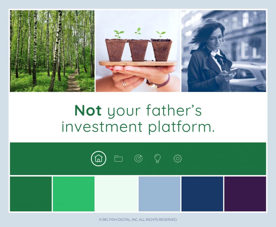
II. Mood Board Example – Dark Theme
The second mood board provides a darker theme to consider. The deep shades of blue and black plus the image of a modern iPhone give a secure and innovative vibe. The colors include a brighter green and purple so the app is still friendly and approachable. Overall there’s a sense of this company being a little edgy to align with their slogan and remind the user that this isn’t an old-school investment platform.

The mood boards above give the investment company two different options to consider, depending on which best resonates with their team and matches their vision for how the app should look and feel.
How to Create a Mood Board for UI and UX Design
Before creating a mood board for an app design project, we always start by talking with stakeholders – for us, this is our clients and ideally a sample of people who will use the app we are designing.
Step 1: Review Brand Guidelines, if applicable
Our mood boarding process lends itself very well to app and software design projects involving new concepts that don’t yet have an established brand.
On the other hand, if our client already has an established brand that will carry over into the app, we’ll want to familiarize ourselves with their brand guidelines and any supporting assets.
Step 2: Meet with Stakeholders
We have a couple exercises we walk through to get our clients thinking about what they want the vibe for their software to be and how they want people to feel when using it.
Through our process we choose five guiding words that best capture this. Here are some examples of what the five might be:

We also directly ask our clients how they want the software to look, and make note of the words they use.
These discussions give our team helpful insights that will guide the creative process at every stage of the app design project.
And there is more.
Users are stakeholders too!
The outcomes matter to them. So we’ll want to know what their goals and pain points are.
For example, if a pain point is that existing apps in this space are very legacy looking, hard to use and complicated – and our clients want to solve for this – we will recommend designing software that feels modern and helpful, for example.
Knowing a bit about the demographic and psychographic characteristics of the people who will use the software is also helpful. For example, if the app will be used by construction crews in the field we’ll know not to include images that depict office settings because that’s not the vibe our client is going for.
Step 3: Curate Visuals for the Mood Board
We’re now ready to start curating for the mood board! At Big Fish we usually create two different mood boards for our clients to choose from.
What to Include on a UI/UX Design Mood Board
What you include on a mood board will vary depending on the project and designer.
When we first started using mood boards at Big Fish, we knew they would look a bit different in the context of UI and UX Design compared to interior design.
Here are some of the elements we include in our app design mood boards.
Color Palette – We almost always create and display a color palette on our mood boards. This gives our clients an idea of the colors we propose for that particular mood, and an opportunity to see how it feels in a very concrete way. If our client has an established brand and color palette already we will use that to guide the mood boarding process instead of creating one from scratch.

Images – Images can be used in a variety of ways on UI and UX design mood boards! One of our favorites is to include an image that depicts real people using the app in their environment, such as an image of a dentist holding an iPad in a dental office. We also use images that convey the feel or vibe – such as wooden planks to convey a rustic vibe or a certain type of car parked outside a beautiful home to convey a luxurious vibe.
Product imagery – For apps that will display or sell products we may include product images on the mood board that are styled similarly to how we suggest our client style their own product images. The style could be a treatment over the image, or physical styling such as all products being photographed with a white background.
Icons – Sometimes we include icon designs on a mood board. We may later incorporate these same icons into the software, or some similar version of them.
Here is an example of a mood board we created that includes icon concepts.
![]()
Words or Quotes – We all know that words give rise to feelings, and we often use them to guide the direction of a mood board. This could be a relevant slogan or our client’s brand words.
Logo – If our client already has a logo, we incorporate it into the mood board. As you can see, in the mood board below we used the logo and also created a white version of it to illustrate how we suggest displaying it overtop a solid color.

Textures and Patterns – When applicable, a mood board might include a pattern we want to incorporate into the app. Or we might demonstrate a gradient that will later appear in the UI.
App Screenshots – Sometimes we use screenshots of other apps in a mood board if that app has a similar vibe to what we want to create.
Illustrations – Illustrations are important to include in a mood board if they’ll be used by your app. This is a good time to establish the illustration style. For example, the Headspace app makes heavy use of illustrations as part of their entire brand experience.
Wisdom from the Deep Sea
Mood boards are not art. With art there is an understanding that each person viewing the piece will have their own interpretation, including the artist themself! When mood boarding for the sake of UI and UX design, the dominant purpose is to get everyone on the same page. Though someone may prefer one mood board over another, if all stakeholders are left scratching their head pondering the reason behind it all – the mood board has failed.
Need to Hire an Expert App Design Team for Your Project?
If you’re interested in hiring our app design company simply reach out to start the conversation and we’ll take it from there. Someone on our team will respond with a few questions to ensure it’s a good potential fit, then we’ll set up a call to discuss and answer any questions you have. We look forward to hearing from you!